Branding for SLK%20Foods
Branding for SLK%20Foods
Year: 2014
Work: Branding
View More
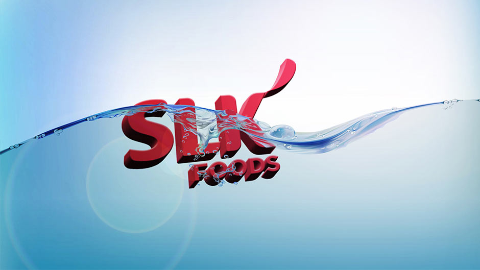
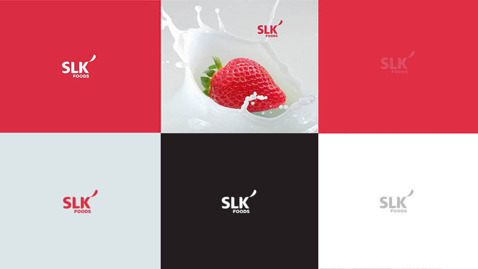
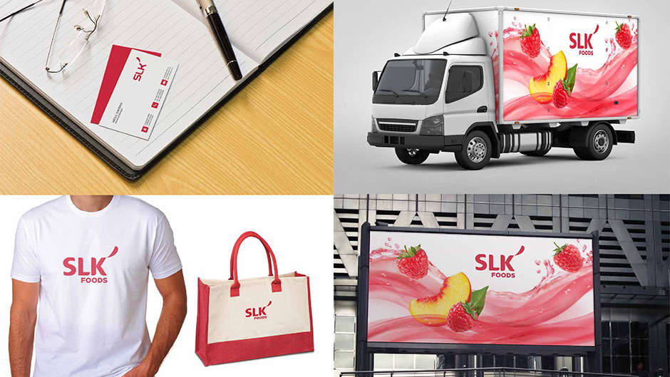
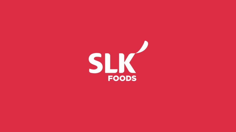
SLK Foods are the pioneers in fruit preserve industry. Since they are the mother company of Happy and Linda, their logo should be simple, neat and elegant. Such an apt typography is used to represent the brand name. The sliced piece of fruit in the falling position brings more elegance to the logo. The color is derived from the color of strawberry to bring the nature's feel to the logo.
